Geography in COVID 2
This is a shortish piece - I am running out of time to do much more on this but I find it so interesting I can't stop!
Any comments please let me know.
In my previous post , I talked about the geographic spread of COVID-19. In particular, I wanted to look at the spread of COVID-19 across the UK.
Lots has happened since then - and I wanted to look more widely, at how COVID-19 has spread around the world, and my theory (and I want to make it clear, this is a theory - backed by nothing but my thoughts and some observational evidence) about mortality differences between countries.
One thing that struck me - and made me write this - was this excellent paper on genomic epidemiology of viral introductions to the UK from the COG-UK consortium. Essentially, they show multiple, seperate introductions of the virus in late February/ early March from Europe (not China!):
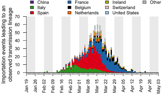
(This image copied directly from the paper, by Pybus et al).
This is felt - I think - to be the most accurate picture of COVID-19 importations. Multiple small introductions in Februaty and March, and then endemic spread locally. The UK lockdown was on the 23rd of March, after most of the importation had happened.
Which made me think: there must have been tonnes of COVID-19 in Spain, Italy and France in that period. How come we have more deaths?
I mean, if returning travellers brought back thousands of separate COVID introductions, all largely from Europe, there must have been a huge amount of endemic spread in those places - only a small percentage of people leave those countries to the UK - and they must have caught it locally. And we locked down shortly after this - so why so much more mortality?
COVID-19 had no effective treatment for most of this time period (Dexamethasone now appears to have an effect in the ventilated population; but that is a fraction of those who die), and medical care is broadly similar across European countries; so the mortality in each country should generally fairly closely map the demographics (i.e. age of the population) and comorbidity (e.g. levels of diabetes, hypertension) in each place.
Now, the UK is certainly slightly fatter and more diabetic than much of Europe, but it is younger, particularly compared to Italy and other soutern European countries. So we should be doing, about, average, not way out the back.
Was it the lockdowns? Look at the Italian graph - the green above. The provincial lockdown (of parts of Northern Italy) was on the 21 Feb, but the national lockdown was on the 9th March. Between that time period - there was still a lot of importation from Italy. The Spanish lockdown started on the 14th March - again, there was huge importation to the UK before then. There must have been more cases in Spain than were imported to the UK, and we only locked down a week later, so the number of cases in Spain must have been higher at the point of lockdown, right? And the same for France, Italy, etc.
After thinking about this for a while, and discussing with some much brighter people than me, I started to wonder if this was to do with the geography. The UK is a highly connected country, with large urban conurbations, lots of internal travel (particularly to London), and busy roads and public transport. University students often travel far away to university, rather than going to the local university, which is more common in many other countries.
And as discussed in my previous blog, COVID-19 got everywhere in the UK. Using the MSOA (Middle Super Output Area - a silly name for a good concept - a geographic block of around 12,000 people - there are 7,200 in England and Wales) data, nearly all MSOA's have met the pandemic By May 31st (the latest ONS data), only 254 of 7,201 MSOA's had not had a COVID death.
I wanted to see if this was true in other countries, and how this affected country level mortality. My theory was: places with more geographic spread of disease would have worse mortality. On one level, that's super obvious (more spread = more disease = more death), but it might be more useful than that (or it might not!)
One question that this raises is does the spread or the intensity of the disease matter. I.e, to reduce deaths, should one try and stop the disease spreading to new areas, or reduce the intensity of a disease in a given area. Of course, some policies will do both, but some will simply do one or the other. If deaths are strongly related to geographic spread (rather than intensity in a given area), then we should do our best to contain the virus - (although one could argue the boat has well and truly been missed in the UK).
So, firstly, let's look at all the countries in the world, and the mortality rate vs a meaure of geographic spread. All this data is from the GitHub open-covid-19, and it can all be reproduced from my Github.
So how do we measure geographic spread in a country? Well, there are lots of ways, I suppose, but one way to do with the data available is to look at the coefficent of variation (cv) of death rates within regions of a country.
The coefficent of variation is simply a measure of the amount of variation (it's the standard deviation divided by the mean). If you have a country with ten regions, and they all have the exact samedeath rate, then the CV will be 0 - no variation, and if there is lots of variation (i.e. one region has a very high death rate, but all the others are low, then the CV will be higher).
Luckily - we have regional data for some countries from the COVID-19 tracker!
To be clear here, I calcualated the death rate from simply total deceased/population, and I calculated the CV by getting the death rate in each region, and then calculating the mean and standard deviation of this.
Here, we can see that Afghanastan reports over 34 regions, and has had 675 deaths, with a CV of 1.06. This is quite different to Austria, which has much less variation: a CV of 0.578.
Of course, there is a relationship between the number of regions each country has, and the level of variation, but there is little we can do about that (if you do have an idea on how to fix this - let me know). So, in general, the more regions there are, the more opportunity for variation:

Each dot on the above plot is an individual country. I've not named them here for ease of visualisation
Regardless, there is no relationship between number of regions and death rate (why would there be?), so this probably just adds a bit of noise. You can plot this yourself to check.
So, what is the relationship between within country variation / geographic spread of disease and death rate of a country?

Bingo. Here is the same plot, with named countries. It's messy, but allows you to have an idea. Also note the suspiciously low rate in Venezuela, which has allegedly been fiddling the numbers. Also note the position of the UK - disease everywhere - and China - disease largely confined to Wuhan.

So it seems plausible - more geographic spread - more disease - more deaths. But - I hear you say - places with very few cases of COVID might have high CV - just by luck - one region has a small outbreak, and this pushes the CV up, and makes the country look fantastic, but actually, there was never much COVID-19 anyway.
Let's limit it to countries with more than 5,000 deaths. There still seems to be a relationship, although perhaps less clear.

Well, that's slightly interesting, but perhaps not much more than that. There is a huge variation between those countries, and perhaps comparisons between them are a bit mad, for lots of reasons. So why don't we focus now on the U.S, again taking data from the Open Covid Tracker.
The US has fifty states, and around 3,000 counties. These differ in size (and are radically different between each other), but given US states are so big, we can go down a leve
l, and look at comparing US states. There is a large disparity in death rates across US states - and can this be explained by geographic spread across them?

I have highlighted the three worst states here, but again, there does seem to be a relationship. States that have limited variation (i.e. most counties have similar levels of disease) have higher death rates.
Finally, let's go back to the UK and look at local authorities and deaths. This is different data from the open-covid Github - it is extracted from the ONS mortality data. This includes two time points for deaths, each at MSOA (very local) level, up to April 17, and up to May 31.
First, lets simply replicate what we did for the US states with local authorities. Local authorities in England and Wales differ in size and shape, but they are all made up of MSOA blocks, and we can replicate the analysis above with US states. Do local authorities that have more geographic spread have a higher death rate?

Again, yes!
A final, final neat trick we can do is use the two data points provided by the ONS to try and see if we can 'predict' death rates from geographic variation. The ONS released data up to the 17th April, and we can calculate the CV from that data, and then compare that to the CV generated from the latest dataset. So we can ask: does the geographic spread of disease by April 17 predict the future deaths in a given local authority?

Yes - to some extent we can. Some critics might argue CV is too complex here, or hard to interpret. So one alternative is to simply plot the number of MSOA in each local authority that had COVID by April 17. In some LA's, this was 10-15%, wheras in other LA's, all of the MSOA's had had a COVID death. If we plot that here, we can see the same relationship: geographic spread in a region predicts eventual rate of death.

Now, there are lots of caveats of this, and I want people to tell me I'm wrong!
However, it seems to suggest that one of the critical determinants of any areas eventual mortality is simply how much it has spread within that are. Now, this is kind of obvious, but may help explain criticism of policy (e.g. the UK government). It's simply that our COVID-19 reached everywhere in the UK, whereas in other countries there was more ability to regionally contain.
I would love to do more on this but I really don't have time - but I will continue to do my best!
However, all the code and raw data is available online - or at my GitHub - file forblog2.R
Thanks again to all I have discussed this with - particularly Danny Dorling, George Davey Smith, and Tim Morris.
Any comments please let me know.
In my previous post , I talked about the geographic spread of COVID-19. In particular, I wanted to look at the spread of COVID-19 across the UK.
Lots has happened since then - and I wanted to look more widely, at how COVID-19 has spread around the world, and my theory (and I want to make it clear, this is a theory - backed by nothing but my thoughts and some observational evidence) about mortality differences between countries.
One thing that struck me - and made me write this - was this excellent paper on genomic epidemiology of viral introductions to the UK from the COG-UK consortium. Essentially, they show multiple, seperate introductions of the virus in late February/ early March from Europe (not China!):
(This image copied directly from the paper, by Pybus et al).
This is felt - I think - to be the most accurate picture of COVID-19 importations. Multiple small introductions in Februaty and March, and then endemic spread locally. The UK lockdown was on the 23rd of March, after most of the importation had happened.
Which made me think: there must have been tonnes of COVID-19 in Spain, Italy and France in that period. How come we have more deaths?
I mean, if returning travellers brought back thousands of separate COVID introductions, all largely from Europe, there must have been a huge amount of endemic spread in those places - only a small percentage of people leave those countries to the UK - and they must have caught it locally. And we locked down shortly after this - so why so much more mortality?
COVID-19 had no effective treatment for most of this time period (Dexamethasone now appears to have an effect in the ventilated population; but that is a fraction of those who die), and medical care is broadly similar across European countries; so the mortality in each country should generally fairly closely map the demographics (i.e. age of the population) and comorbidity (e.g. levels of diabetes, hypertension) in each place.
Now, the UK is certainly slightly fatter and more diabetic than much of Europe, but it is younger, particularly compared to Italy and other soutern European countries. So we should be doing, about, average, not way out the back.
Was it the lockdowns? Look at the Italian graph - the green above. The provincial lockdown (of parts of Northern Italy) was on the 21 Feb, but the national lockdown was on the 9th March. Between that time period - there was still a lot of importation from Italy. The Spanish lockdown started on the 14th March - again, there was huge importation to the UK before then. There must have been more cases in Spain than were imported to the UK, and we only locked down a week later, so the number of cases in Spain must have been higher at the point of lockdown, right? And the same for France, Italy, etc.
After thinking about this for a while, and discussing with some much brighter people than me, I started to wonder if this was to do with the geography. The UK is a highly connected country, with large urban conurbations, lots of internal travel (particularly to London), and busy roads and public transport. University students often travel far away to university, rather than going to the local university, which is more common in many other countries.
And as discussed in my previous blog, COVID-19 got everywhere in the UK. Using the MSOA (Middle Super Output Area - a silly name for a good concept - a geographic block of around 12,000 people - there are 7,200 in England and Wales) data, nearly all MSOA's have met the pandemic By May 31st (the latest ONS data), only 254 of 7,201 MSOA's had not had a COVID death.
I wanted to see if this was true in other countries, and how this affected country level mortality. My theory was: places with more geographic spread of disease would have worse mortality. On one level, that's super obvious (more spread = more disease = more death), but it might be more useful than that (or it might not!)
One question that this raises is does the spread or the intensity of the disease matter. I.e, to reduce deaths, should one try and stop the disease spreading to new areas, or reduce the intensity of a disease in a given area. Of course, some policies will do both, but some will simply do one or the other. If deaths are strongly related to geographic spread (rather than intensity in a given area), then we should do our best to contain the virus - (although one could argue the boat has well and truly been missed in the UK).
So, firstly, let's look at all the countries in the world, and the mortality rate vs a meaure of geographic spread. All this data is from the GitHub open-covid-19, and it can all be reproduced from my Github.
So how do we measure geographic spread in a country? Well, there are lots of ways, I suppose, but one way to do with the data available is to look at the coefficent of variation (cv) of death rates within regions of a country.
The coefficent of variation is simply a measure of the amount of variation (it's the standard deviation divided by the mean). If you have a country with ten regions, and they all have the exact samedeath rate, then the CV will be 0 - no variation, and if there is lots of variation (i.e. one region has a very high death rate, but all the others are low, then the CV will be higher).
Luckily - we have regional data for some countries from the COVID-19 tracker!
To be clear here, I calcualated the death rate from simply total deceased/population, and I calculated the CV by getting the death rate in each region, and then calculating the mean and standard deviation of this.
# A tibble: 39 x 6
   country_name number_regions total_deceased population    cv death_rate
   <chr>                 <int>          <dbl>      <dbl> <dbl>      <dbl>
 1 Afghanistan              34            675   37172386 1.06  0.0000182
 2 Argentina                24           1124   44494502 1.67  0.0000253
 3 Australia                 8            104   24982688 1.30  0.00000416
 4 Austria                   9            698    8840521 0.578 0.0000790
 5 Bangladesh               64           1621  161356039 2.50  0.0000100
 6 Bolivia                   9            913   11353142 1.21  0.0000804
 7 Brazil                   27          54971  209469333 0.741 0.000262
 8 Canada                   13           8504   37057765 2.33  0.000229
 9 Chile                    16           4903   18729160 1.40  0.000262
10 China                    34           4648 1392730000 5.41  0.00000334
Here, we can see that Afghanastan reports over 34 regions, and has had 675 deaths, with a CV of 1.06. This is quite different to Austria, which has much less variation: a CV of 0.578.
Of course, there is a relationship between the number of regions each country has, and the level of variation, but there is little we can do about that (if you do have an idea on how to fix this - let me know). So, in general, the more regions there are, the more opportunity for variation:

Each dot on the above plot is an individual country. I've not named them here for ease of visualisation
Regardless, there is no relationship between number of regions and death rate (why would there be?), so this probably just adds a bit of noise. You can plot this yourself to check.
So, what is the relationship between within country variation / geographic spread of disease and death rate of a country?

Bingo. Here is the same plot, with named countries. It's messy, but allows you to have an idea. Also note the suspiciously low rate in Venezuela, which has allegedly been fiddling the numbers. Also note the position of the UK - disease everywhere - and China - disease largely confined to Wuhan.

So it seems plausible - more geographic spread - more disease - more deaths. But - I hear you say - places with very few cases of COVID might have high CV - just by luck - one region has a small outbreak, and this pushes the CV up, and makes the country look fantastic, but actually, there was never much COVID-19 anyway.
Let's limit it to countries with more than 5,000 deaths. There still seems to be a relationship, although perhaps less clear.

Well, that's slightly interesting, but perhaps not much more than that. There is a huge variation between those countries, and perhaps comparisons between them are a bit mad, for lots of reasons. So why don't we focus now on the U.S, again taking data from the Open Covid Tracker.
The US has fifty states, and around 3,000 counties. These differ in size (and are radically different between each other), but given US states are so big, we can go down a leve
l, and look at comparing US states. There is a large disparity in death rates across US states - and can this be explained by geographic spread across them?

I have highlighted the three worst states here, but again, there does seem to be a relationship. States that have limited variation (i.e. most counties have similar levels of disease) have higher death rates.
Finally, let's go back to the UK and look at local authorities and deaths. This is different data from the open-covid Github - it is extracted from the ONS mortality data. This includes two time points for deaths, each at MSOA (very local) level, up to April 17, and up to May 31.
First, lets simply replicate what we did for the US states with local authorities. Local authorities in England and Wales differ in size and shape, but they are all made up of MSOA blocks, and we can replicate the analysis above with US states. Do local authorities that have more geographic spread have a higher death rate?

Again, yes!
A final, final neat trick we can do is use the two data points provided by the ONS to try and see if we can 'predict' death rates from geographic variation. The ONS released data up to the 17th April, and we can calculate the CV from that data, and then compare that to the CV generated from the latest dataset. So we can ask: does the geographic spread of disease by April 17 predict the future deaths in a given local authority?

Yes - to some extent we can. Some critics might argue CV is too complex here, or hard to interpret. So one alternative is to simply plot the number of MSOA in each local authority that had COVID by April 17. In some LA's, this was 10-15%, wheras in other LA's, all of the MSOA's had had a COVID death. If we plot that here, we can see the same relationship: geographic spread in a region predicts eventual rate of death.

Now, there are lots of caveats of this, and I want people to tell me I'm wrong!
However, it seems to suggest that one of the critical determinants of any areas eventual mortality is simply how much it has spread within that are. Now, this is kind of obvious, but may help explain criticism of policy (e.g. the UK government). It's simply that our COVID-19 reached everywhere in the UK, whereas in other countries there was more ability to regionally contain.
I would love to do more on this but I really don't have time - but I will continue to do my best!
However, all the code and raw data is available online - or at my GitHub - file forblog2.R
Thanks again to all I have discussed this with - particularly Danny Dorling, George Davey Smith, and Tim Morris.
I GOT CURED OF HERPES WITH THE HELP OF DR OGU I Am from North Carolina, United State. I caught genital herpes from my ex boyfriend who never had any symptoms of herpes . I had it for 4 years ,and it has literally affected my life before I got cured. People think herpes is really a minor skin irritation, herpes has long term effects on health. The stigma attached to this virus by ignorant people is ridiculous. Most people have herpes in one form or another but they might not be aware of it. I would like to advise people on how I got rid of my herpes by using Dr OGU herbal medicine. I saw a comment posted by a woman from Germany on the internet that she got rid of her herpes with the help of doctor OGU. I was so happy when I saw that post. Honestly I thought it was a scam, and then I decided to give it a try i quickly collected the doctor OGU contact email and I emailed him. Within 1 hr he responded to my email. i explained things to him and he told me not to worry that he will help me. i ordered for his medicine product which was sent to me via DHL. that was how i got the herbal medicine and i used it as i was told for the period of 6 days which is twice a day ( morning and at night before going to bed) .after 8 days, i found out that the herpes was no more and this was also confirmed by my doctor. if you have herpes or other similar disease and you want it cure, kindly contact doctor OGU Patrick via this email ; drogugusolutionhome@gmail.com or text him via: +1 719 629 0982 .
ReplyDelete